onXmaps
Trail Reports

User Problem:
How might we help offroaders, skiers, and hikers understand the conditions of a trail before they arrive, so that they can choose the right trail and be adequately prepared for their adventure?
Business Goal:
Increased conversion to paid subscriptions and drive shares of rich content trails in the app
Solution:
Collect photos, free form trail reports, gear recommendations, and more from users who’ve already visited a trail
Skills:
Moderated user interviews, competitor teardowns, visual design, high fidelity mockups, component creation, interaction design
Overview
My role:
Lead Product Designer
Platforms:
iOS, Android, Web
Duration:
6 months (2023)
Collaborators:
Mike Redkey (Product Designer)
Amy Devin (Research)
Tools:
Figma, UserInterviews.com, JIRA
About onX

onX makes recreational map apps. The company has three apps: onX Backcountry, onX Offroad, and onX Hunt, but it’s expanding into new activities like fishing.
Users are hardcore adventurers with an appetite for extreme adrenaline and pushing their edge. Safety and preparedness is critical to these users because they are going to remote, high risk places and they need robust data to plan their adventures.
The problem
Good trail data can be the difference between a fun day and a miserable day. Or the difference between life and death. But lot of onX’s trail data is static - the company hires trail guides to gather key specs about the trail, write a few paragraphs about it, and share a few photos.
However, conditions and statuses of a trail change frequently due to weather, natural disasters, land management bureaus, and more. Outdoor adventurers need to know what they can expect and if they can do the activity they want. Recency of the data is critical.
My team was the Connection team, which is the team in charge of facilitating user-to-user interactions. We were tasked with tackling with the problem, and creating a solution that scaled across both the onX Backcountry and onX Offroad products, for 6+ different types of activities.

Personas

Offroaders drive a mix of 4x4s (trucks), side-by-sides (also known as UTVs), dirt bikes and ATVs. They go on trails based on their vehicle type, vehicle modifications and experience driving. They want to see the country, do other activities along the way like fishing or kayaking, and love to camp. But within offroaders, needs and lifestyles vary greatly. There are four core sub-segments within the offroad community:

Overlanders
Overlanders drive far and long to see the country in more comfortable vehicles (ex: #vanlife). They stick to safer trails.

Rockcrawlers
Rockcrawlers climb over large boulders/ledges - needing to recover a stuck/rolled over vehicle is part of the fun.


Dirt bikers / ATV riders
Want to whip around for speed over tough terrain. Adventures need to be fun, but navigable for a smaller vehicle.

Snowmobilers
Want to run trails with good snow coverage and/or groomed snow.
onX Backcountry users try to spend as many weekends as possible out in the mountains and on the trails. They are year-round adventurers with an appetite for calculated risk. Many participate in multiple outdoor recreation activities and will pick up whichever activity is best for the conditions.

Backcountry skiiers
Hunting for fresh powder and beautiful views with nobody else in sight. Avalanche risk, storms, and getting lost can be deadly. Gear and training to survive is critical.

Hikers & Backpackers
Need to know what gear to pack, where to find water, and where to camp.

Competitive Analysis
I audited 7 mapping apps used by offroaders and backcountry adventurers.
Structured trail reports free-form text trail descriptions, and user submitted photos were the most common functionalities for user-to-user interactions and user-generated data.
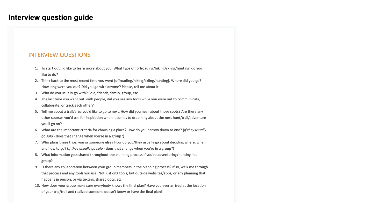
Running moderated user interviews
I wrote the research plan, recruited participants, did the scheduling and synthesized results
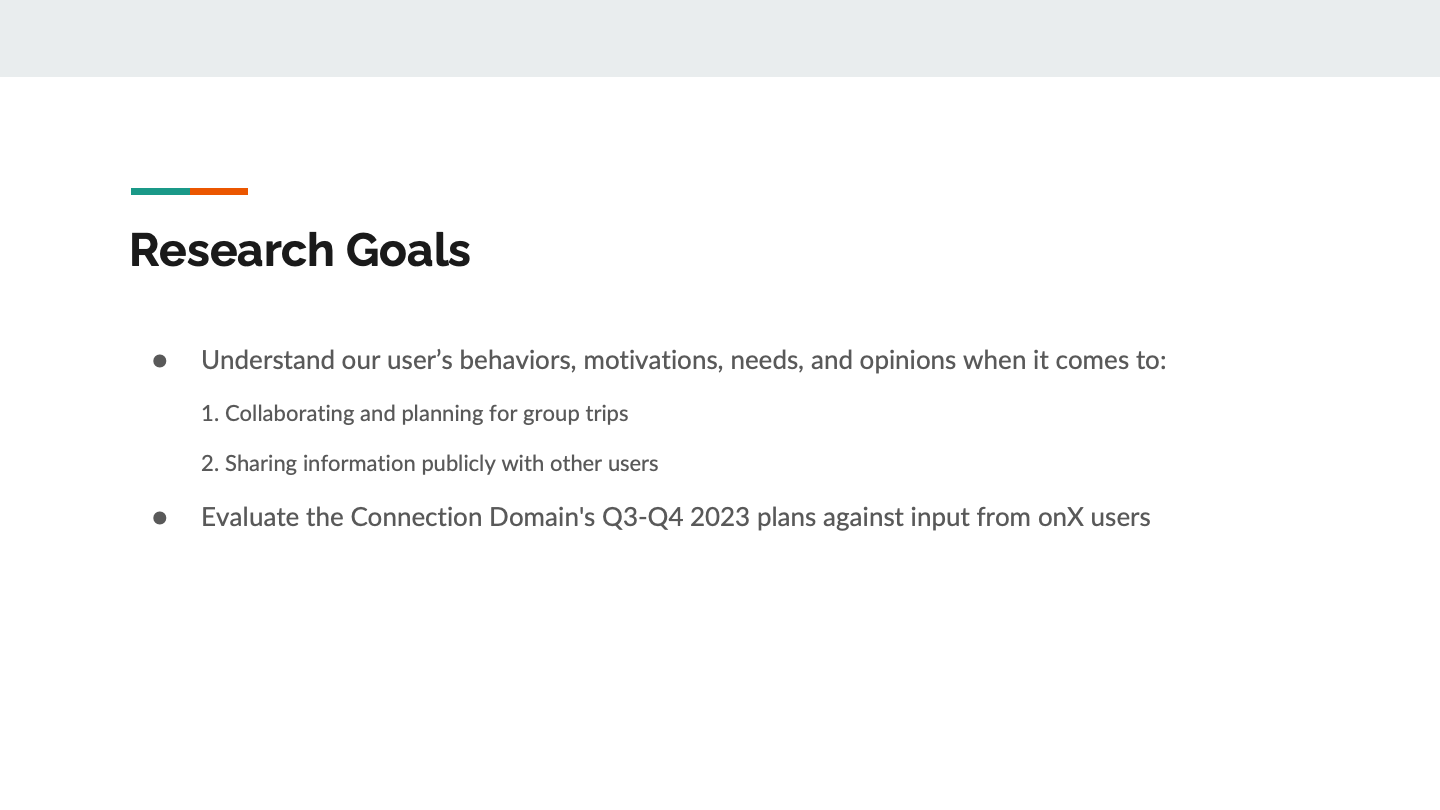
Goals
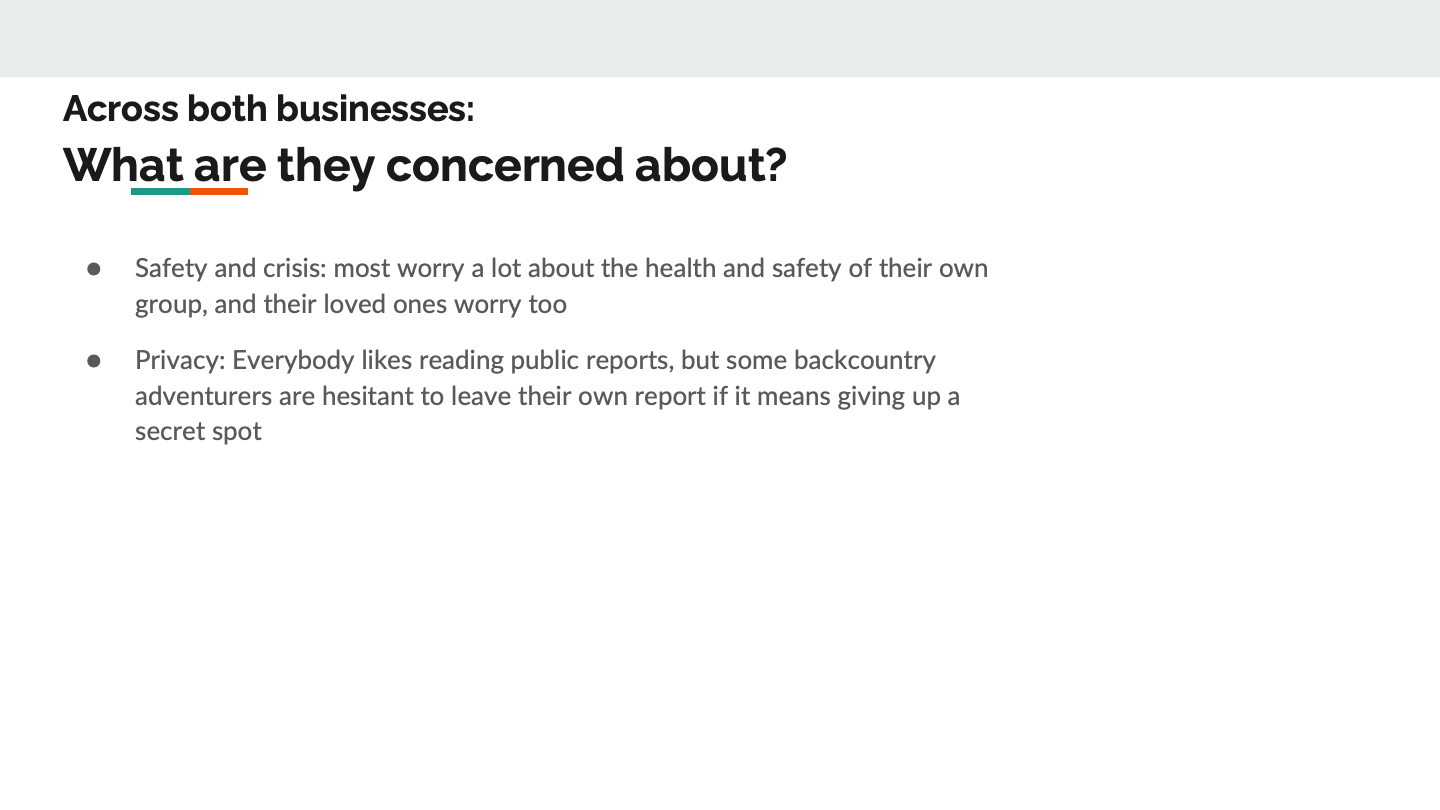
Understand attitudes around sharing trail data with others and the importance of condition information for each activity type
Hypotheses
Users want to share content publicly and read/view others’ content
The most important factors when choosing/planning an adventure are safety, conditions, and fun factor
Human-generated data is subjective and relative - how helpful it is depends on who is reporting it and their similarity to the person using the data
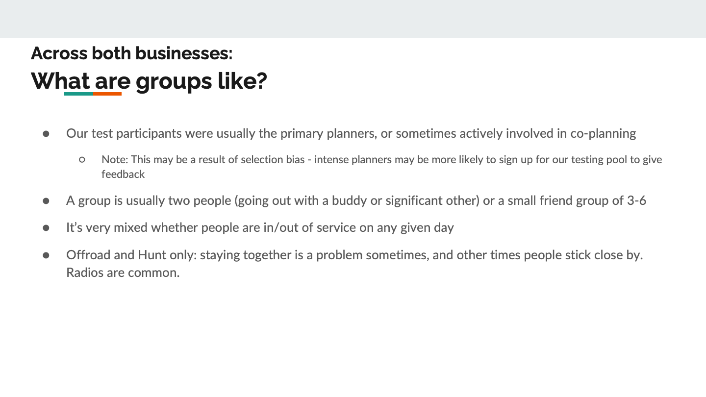
Participants
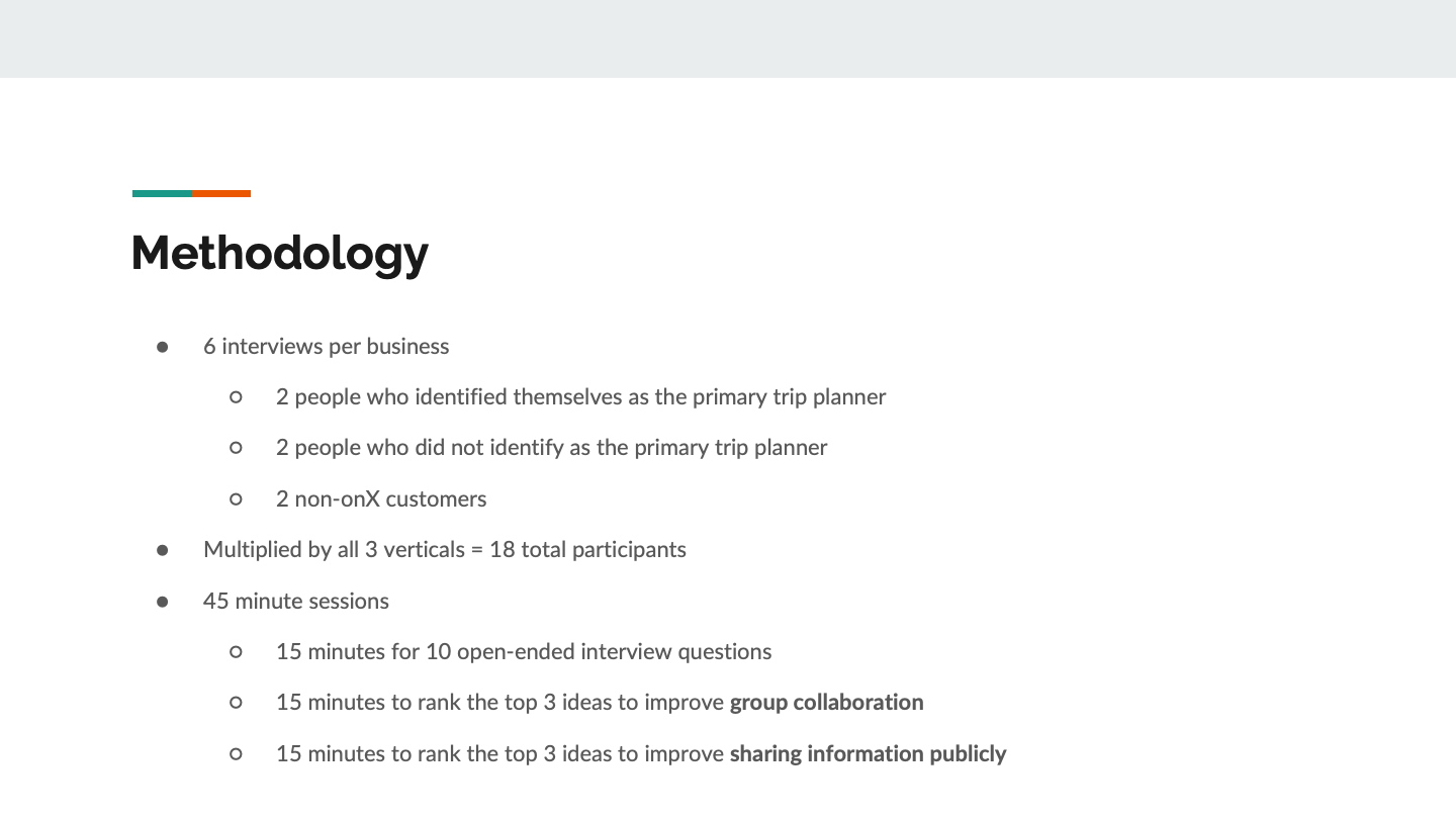
10 offroaders + 10 backcountry adventurers
Recruited for various activity types
Mix of onX users and non-users
Method
Moderated interviews with Userinterviews com
Discovery questions
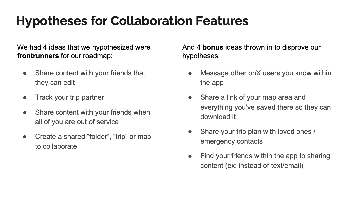
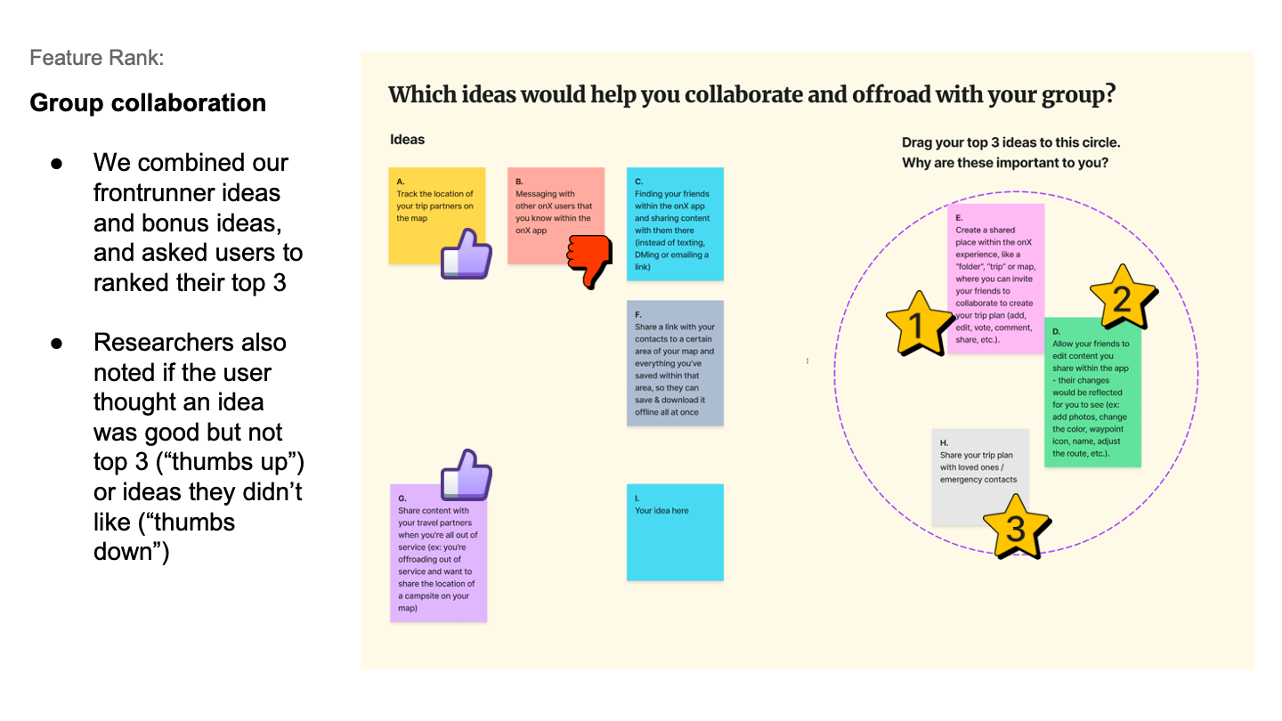
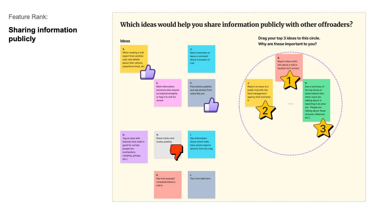
Ranking exercise to inform ideas we’d brainstormed for our roadmap
I drafted study guides with our researcher Amy and did recruitment, moderation and synthesis myself
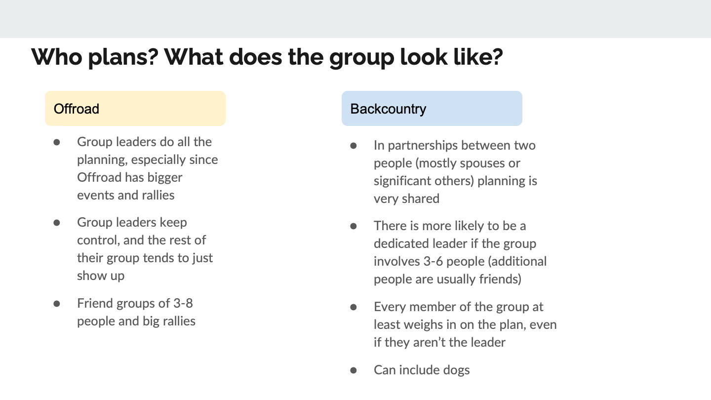
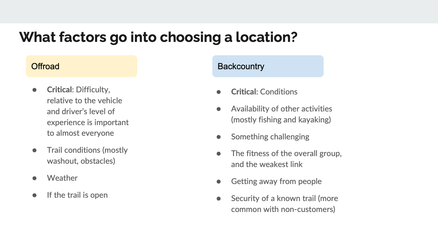
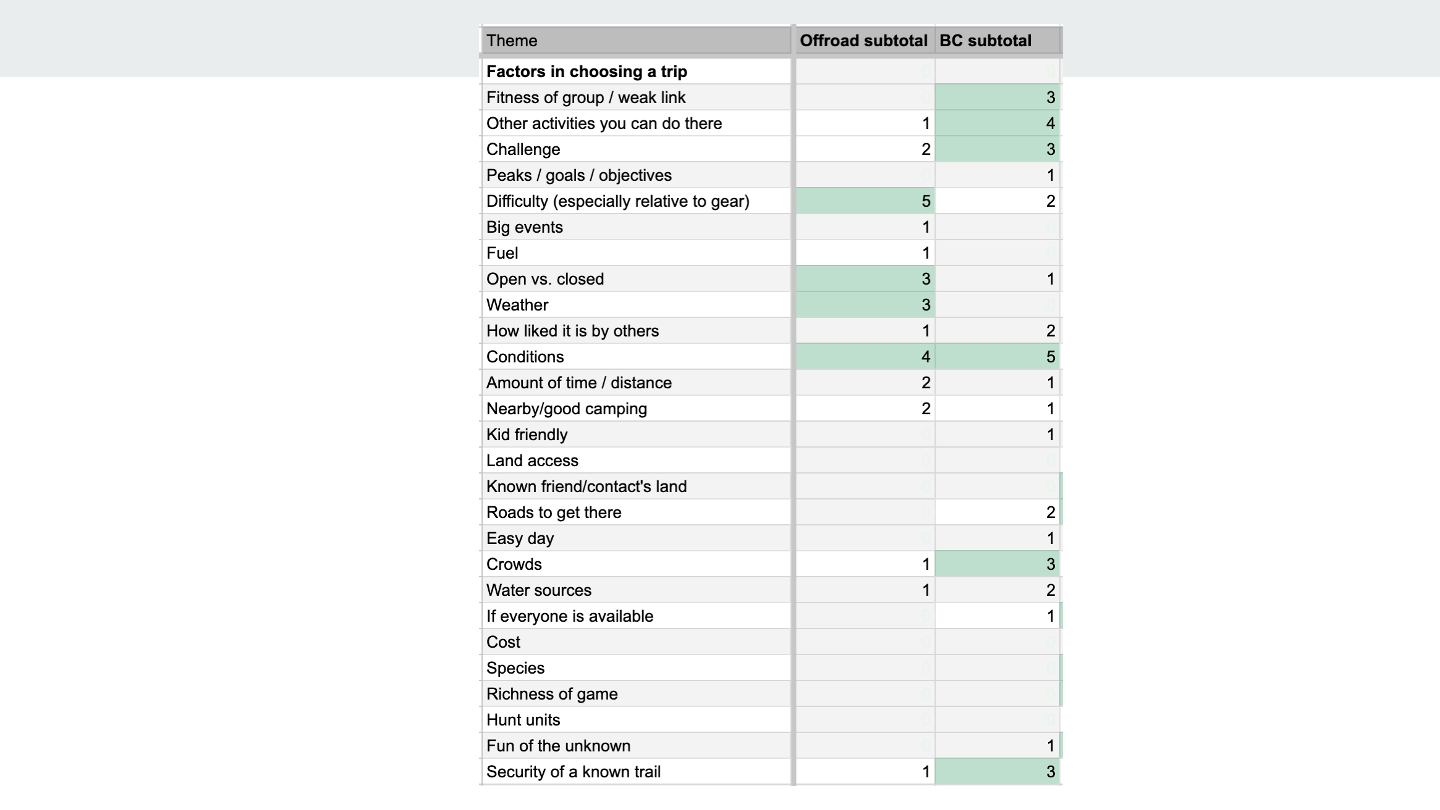
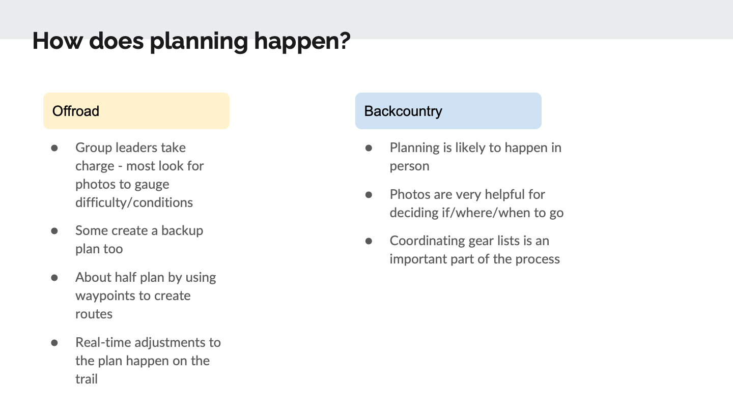
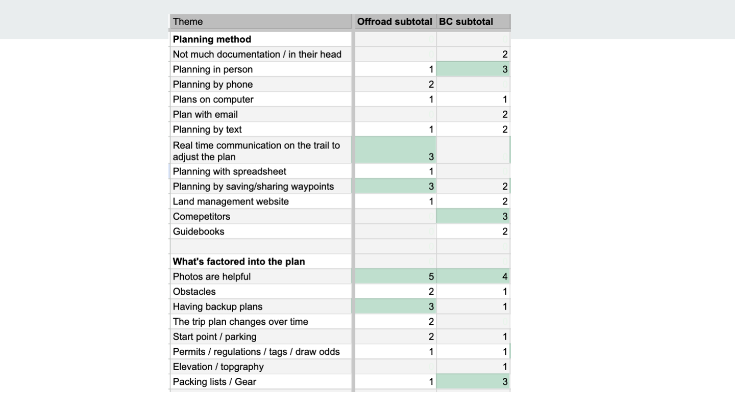
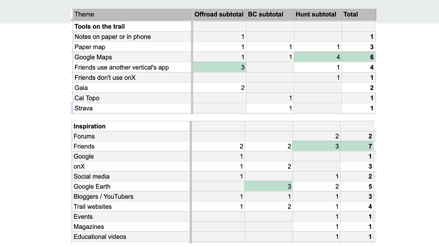
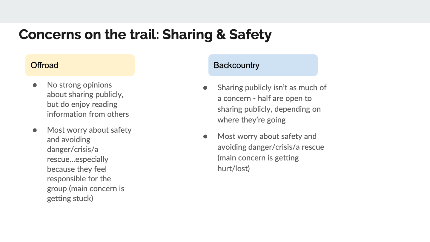
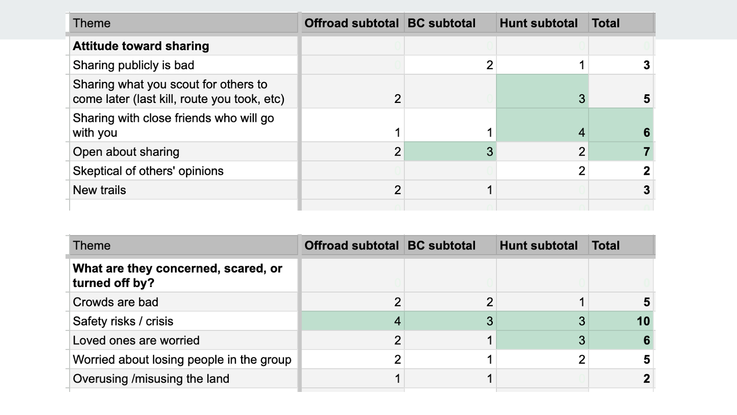
Synthesis and key findings

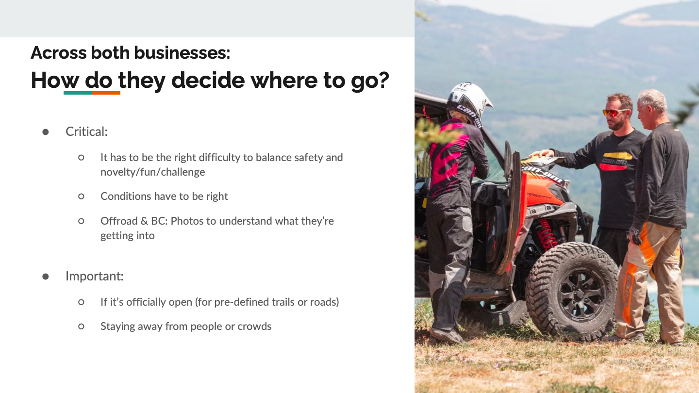
“One guy could say this trail is a blast in a high-clearance Raptor (4x4 truck). But we get flooding in southern Tennessee and someone with no clue what they’re doing could end up having to get dragged out in their Subaru if the washout is too bad.”
“I swipe around Google Earth looking for places that will have loads of powder (snow). But you also have to check the weather ‘cause things can change in a matter of hours. It could melt and be a waste of a day or you could risk getting buried (by an avalanche)”
I engaged the team in synthesis - all developers and PMs watched 2 sessions and helped with note-taking
Logged common themes in a spreadsheet, with findings broken down by Offroad vs. Backcountry
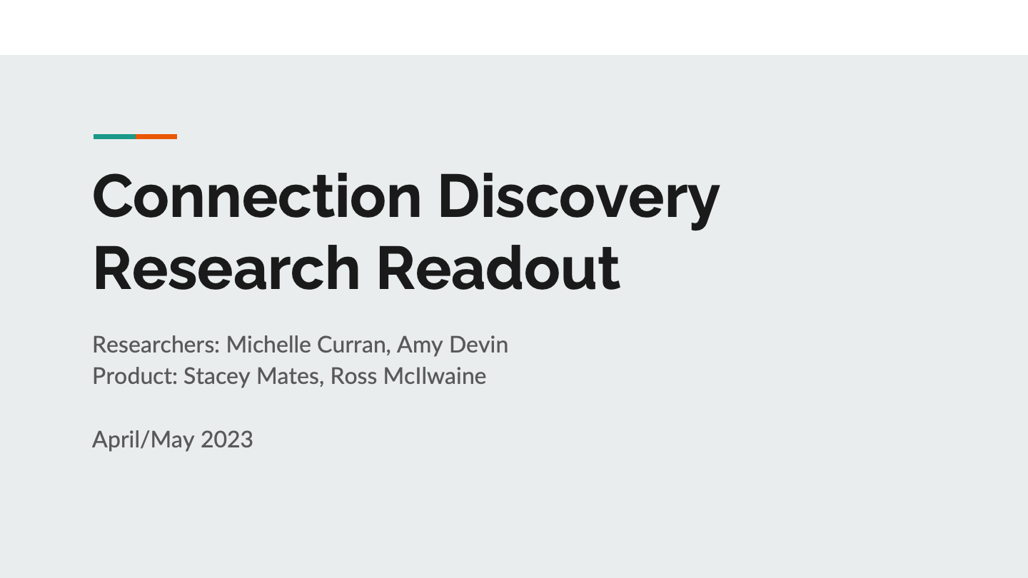
Research readout
Scroll to see the deck I presented to leadership and PMs, engineers, and designers across the company


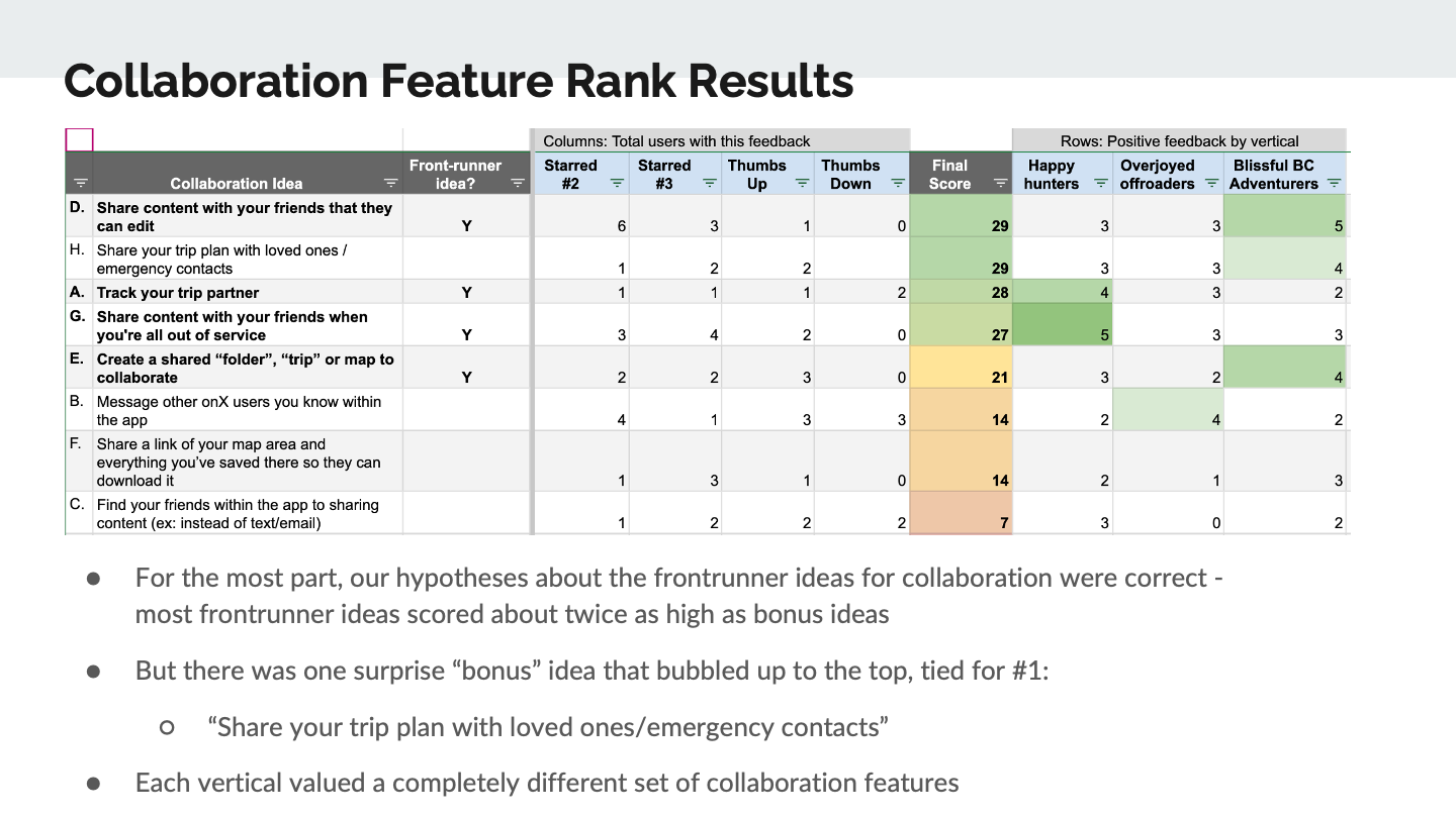


Proposed solution:
User-submitted trail reports and photos
I then led a workshop to affinity map and dot-vote on our biggest areas of opportunity, which led us to align on user-submitted trail reports and photos.
Approach
We decided to leverage the hundreds of thousands of onX Backcountry and onX Offroad user who are out on the trails everyday to supplement the data collected by official onX trail guides. However, we needed to be careful how we ingested and presented the data, since trusting a trail report from the wrong source could lead to a life-threatening situation.
Crowdsource condition information, photos and descriptions to help users understand conditions of trails
Collect data custom to the type of adventurer
Start with Offroad dirt mode
Approach should be scalable for other activity types and businesses - BC and Offroad, and also scale for the launch of onX’s next ventures (fishing, mountain biking)
Use a content moderation service
Build upon the MVP of trail reports
MVP was created by a previous designer (Mike Redkey)
Limited to only Offroaders (excluding snow mode)
Only collected the date/time a user had completed an adventure and if the trail was open, closed, or obstructed
Business Goals:
Obtain coverage of trail reports on the top 10% most popular trails
X% of monthly users submit a trail report
X% of monthly users view a trail report
Increase overall shares of trails
Increase paid trials
Information Architecture
Using the findings from the UX research, I defined the information architecture by grouping similar adventure activities (ex: hiking & backpacking) where users’ needs overlapped. I then defined the different types of data we’d collect:
User data
Activity data
Condition Data
Conditional Observations
Other Observations
Final Hotel UI
I used the findings to make final decisions on high-fidelity designs, and aligned with product and engineering on the following decisions:
Content simplification
Removed data labels to reduce total content
Created a summary view of payment amounts, with ability to drill into payment details as needed
UI improvements
Ability to tab between messages and reservation details without losing context
Visual treatment for accessibility requests
Skeuomorphic card design for credit cards
Visual treatment for timeline
New features
Added Vrbo’s commission to increase transparency and comprehension of payouts
Contact info made available without requiring MFA


Final Vrbo UI
Content simplification
Removed data labels to reduce total content
Simplified payment schedule using expandos to hide/expose details
Consolidated all payment actions into a single action menu
UI improvements
Reduced use of color and badging in payment schedule for payments that were paid or being processed to focus attention only on overdue payments
New features
Ability to drill into payment details as needed and get further granularity


Converged results
Simplified content with one UI for two brands…plus, faster development in the future
Through this project, I was able to reduce cognitive overload for both hotel and Vrbo property managers, making it easier to manage reservations.
By creating UI using consistent card and sheet patterns, I standardized the experience across both brands, leading to faster development time. Designing for both will also be faster in the future.
High fidelity hotel prototype
High fidelity Vrbo prototype
Success metrics
As of September 2022, I have been working with a PM, TPM and 5 developers using an agile methodology to build the new reservation details experience. It’s set to launch at the end of Q1 of 2023.
The primary success metrics will be:
Reduction in customer service contacts
Increase in messaging responsiveness
Do no harm: cancellations
Finally, the Product team estimates we’ll reduce future design and development time by 30% by having a single UI and API for both hotels and Vrbo.
Learnings & next steps
Balance customization and standardization:
Some content and flows can be fully converged for different users, but sometimes the user needs are distinct and the experience must reflect it.
An organizational pivot can be an opportunity for the user experience:
Merging teams and When redesigning both the front and back end of an experience, there’s a lot of room to challenge the status quo. Rather than just copy old content and try to converge it, I had an opportunity to pursue feature parity and eliminate/simplify content.
If I could do this project again, I’d…
Challenge the scope and break it into smaller releases
It was a huge undertaking to merge two businesses, migrate to a new design system, and simplify content all at once.
I’m currently working on the screen reader documentation for this project, which is another learning experience for me.
More projects


